ArtisanEats
Empowering yourself through a self tailored diet.
Roles
UX/UI Designer and UX Researcher
Tools
Figma and FigJam
Timeline
90 hrs
About the project
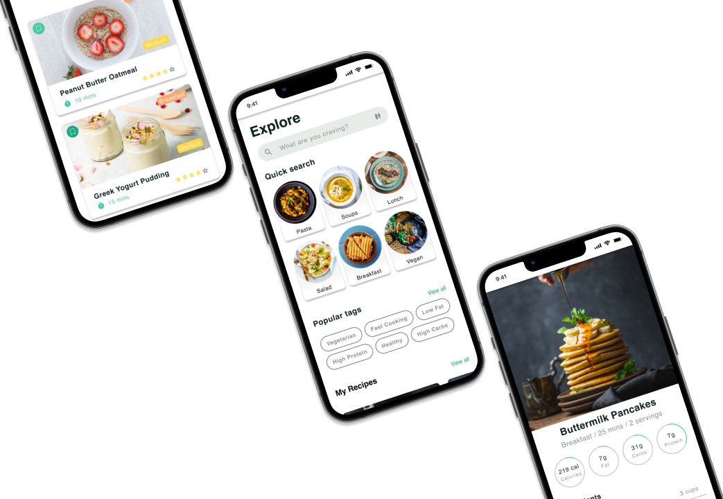
ArtisanEats allows its users to find healthy recipes easily while also aiding its users with creating a Meal plan tailored to their needs. We have all probably heard the expression that food is fuel but busy schedules, poor nutritional choices, and lifestyle habits can all wreak havoc on our diets and energy levels. Finding time to plan meals, knowing which foods to cook and enjoying that food are some daily challenges of anyone who wants to maintain or lose weight and feel energized. Poor nutrition can be a double threat when it comes to fatigue and your overall health and wellness. Too much of certain foods can impact your metabolism, and getting too little of essential nutrients also leads to a host of health problems, including fatigue.
Goals
I aim to help users find recipes quickly and easily.
Allowing the users to create a customizable meal plan.
For users to be able to keep track of what they ate.
Research
Interviews
To gain a deeper understanding of user eating habits, I conducted user interviews with five participants exhibiting diverse dietary preferences. This diverse group, ranging from meal planners to spontaneous eaters, provided valuable insights into a wide range of behaviors. In addition to interviews, I employed contextual inquiry to observe participants in their natural eating environments. This approach proved crucial for uncovering subtle habits and patterns that might otherwise have been missed.
Key Insights
The users mostly or only care about nutrition and taste when it comes to looking for new recipes. The users would definitely like to see recipes and ingredients that are good for the gut and certain aspects of mental health.
Everyone I interviewed had agreed upon that a personalized diet would be very convenient.
All of the participants wanted to find the recipes quick and easy and did not want to deal with anything extra or outside of the recipe.
The users would like to see ingredients that are familiar and has health benefits.
With the people I interviewed, if the food that is unhealthy it gives them less energy throughout the day and that affects their mood by making them unhappy since they were not able to accomplish something because of the lack of energy.
Competitive Analysis
I analyzed competitors like New Brain Nutrition, BrainHQ, Allrecipes, and Cleveland clinic Healthy Brains to identify strengths and weaknesses in their UX.
Findings
Most competitors provide either recipes or meal planning, but few offer an integrated approach.
Recipe search functions often lack advanced filtering, making it hard for users with specific needs.
Tracking tools are usually separate from meal planning features, causing a disjointed experience.
Define
Problem Statement
Busy individuals seeking to maintain or improve their health through diet struggle to find easy-to-use platforms that provide integrated recipe discovery, customizable meal planning, and food intake tracking. ArtisanEats aims to solve this problem by offering an intuitive and seamless user experience that caters to these needs.
User Personas
User journey mapping
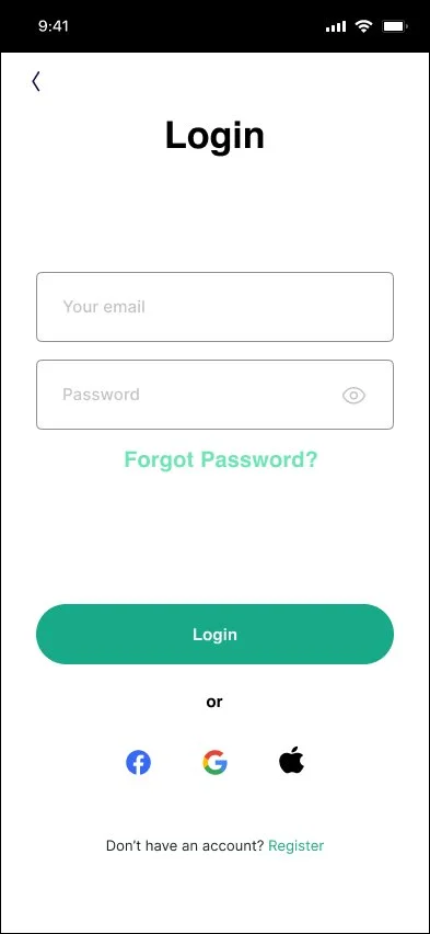
I’ve created 3 user flows for the user to complete. The first user flow is an instance when the user would login and sign up for the app. While signing up the user would be asked some questions that will help the app know the user better and give the right recommendations when the user would be looking for recipes.
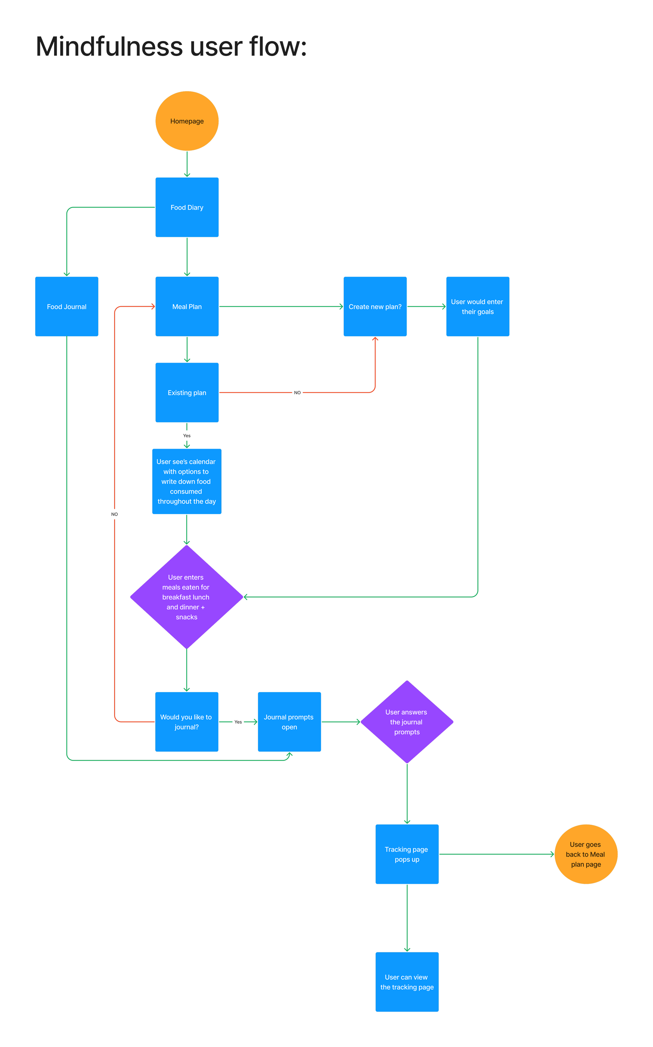
Based off the user flows on top. I’ve created 3 task flows that are essential to the app. The first task flow involves the user entering their fitness goals. The second task flow is when a user would look for a recipe such as a recipe for spaghetti. The last task flow is showing how a user would be able to food journal in the app to keep track of what they ate and plan ahead for their meals.
Login/ Sign up page and entering fitness goals.
Finding a specific recipe
Journaling
Wireframes
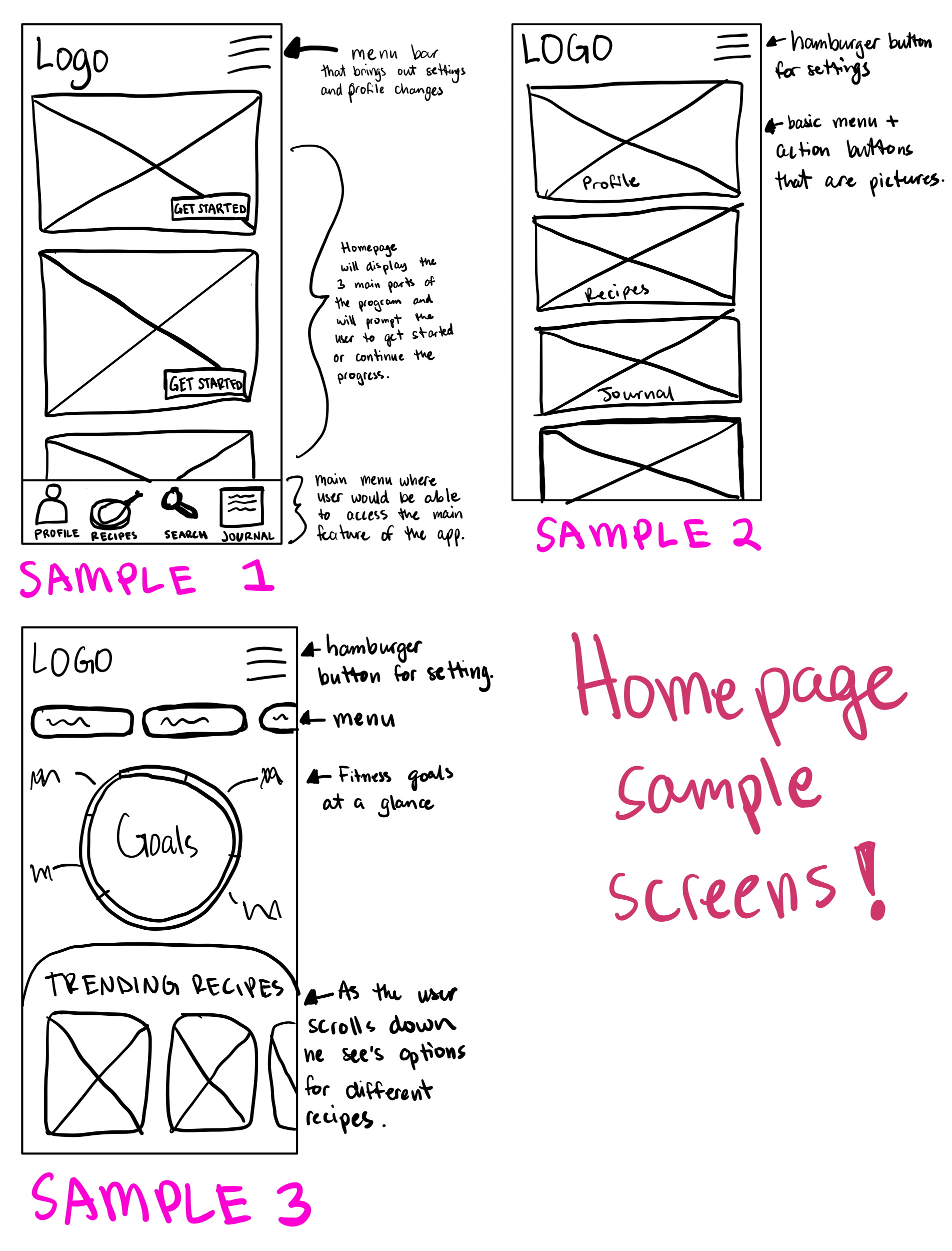
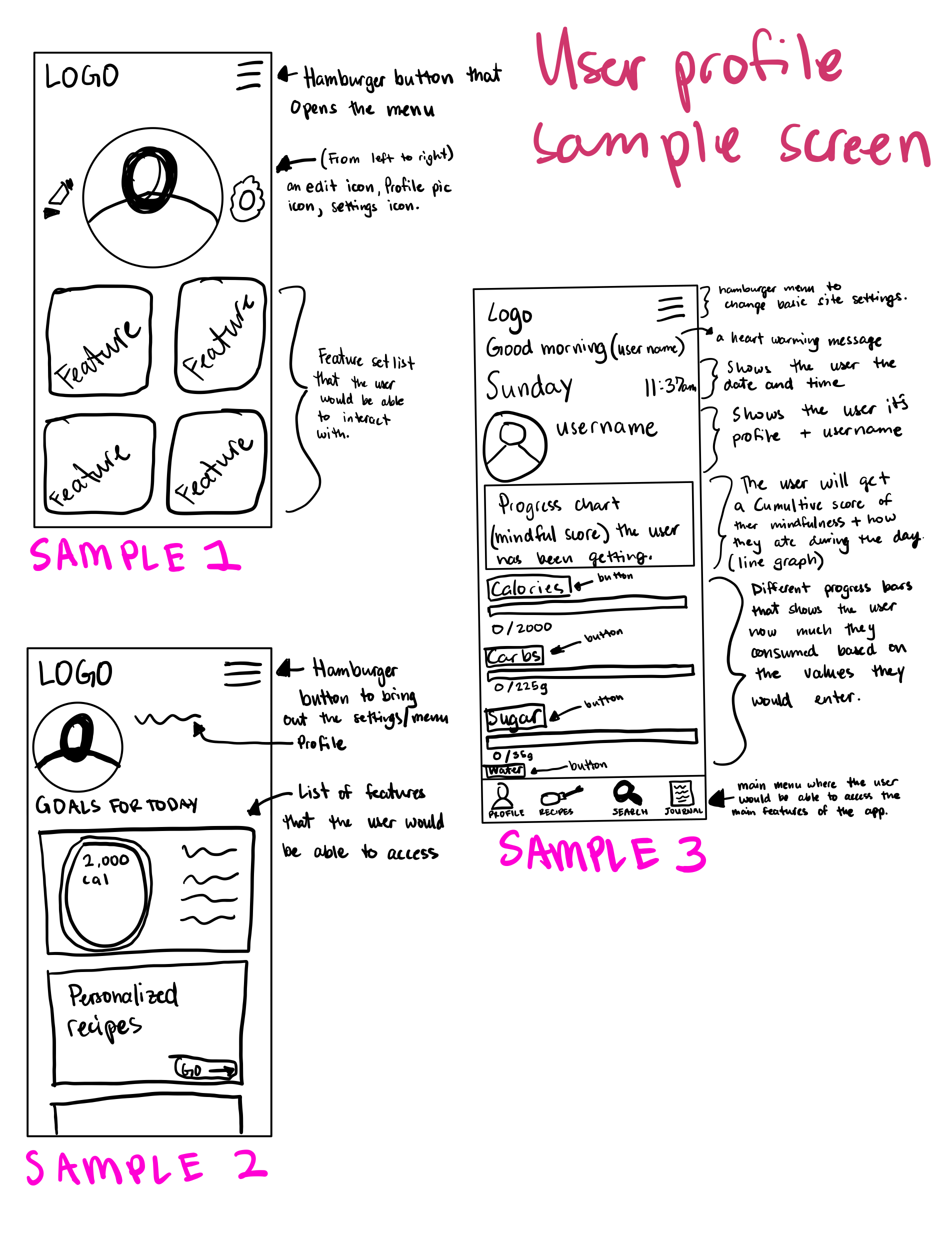
Brainstorming and Sketching
I brainstormed features and sketched initial wireframes for key screens, focusing on:
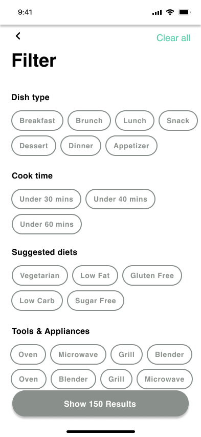
Recipe Discovery: A powerful search function with filters for dietary restrictions, cuisine, prep time, and more.
Meal Planning: An interactive drag-and-drop calendar for customizable meal planning.
Food Tracking: An integrated food diary with automatic logging from selected recipes.
Mid Fidelity Wireframes
User Testing
I conducted usability testing with 5 participants representing our personas. Participants were given tasks to find recipes, create a meal plan, and log their food intake.
Usability Testing Results
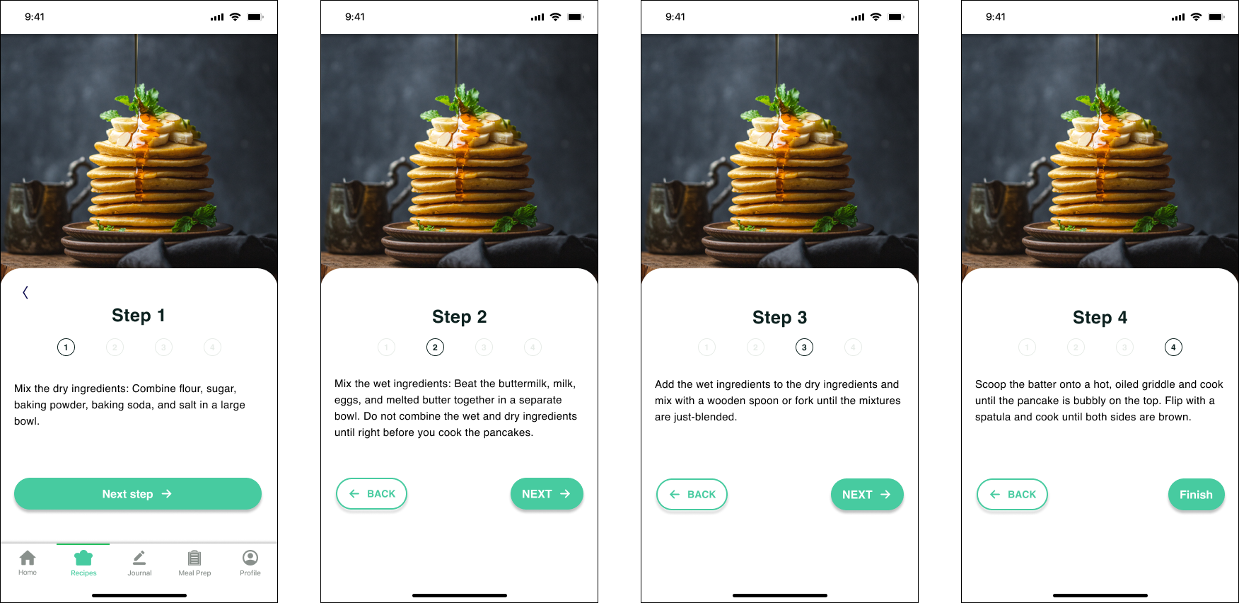
For my first revision I added another step to step 3 and made the numbers that are indicating the page a little bigger and the circles around it in a different color.
When signing up I did not have enough questions to fully assess what the user needs so I added enough questions in order to fully assess the what the user needs in order to get a custom recommendation.
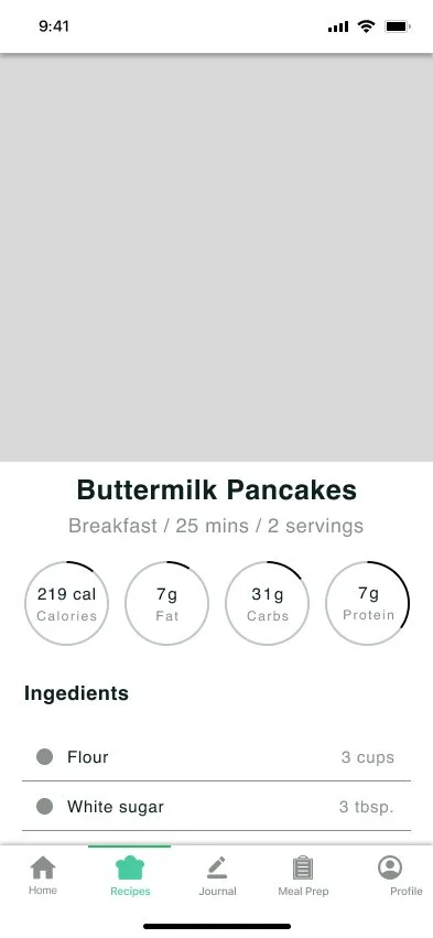
In the comments section of the recipe, I added how many stars a user gave to give the user a better idea of individual ratings for the recipe.
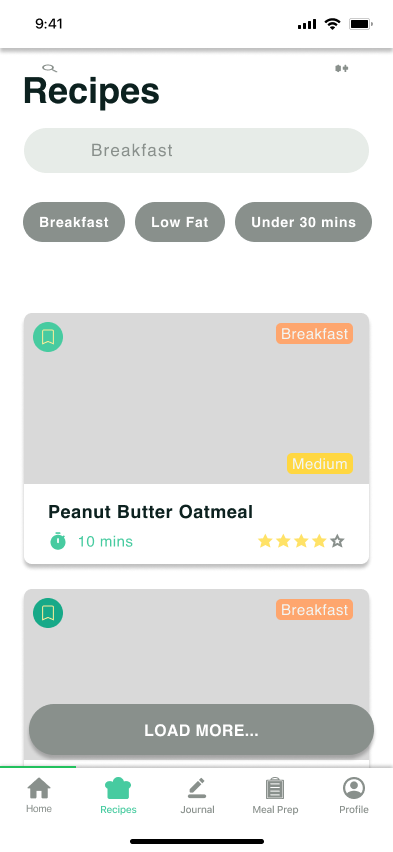
When viewing the recipe from the main page instead of having a like and bookmark button which is redundant I added a label that tells the user the difficulty of the recipe.
Made the calendar smaller and added a feature that a user could just click if they’ve completed the task they want to complete.
