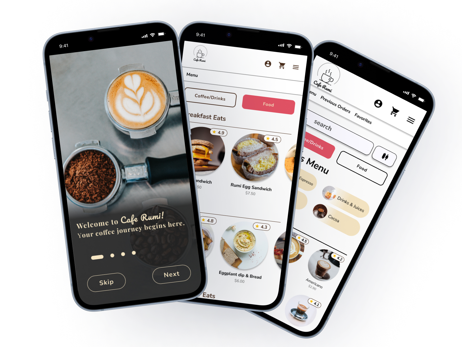
CAFE RUMI
End-to-end application for a Local Business
Project Background
Cafe Rumi, a beloved San Leandro institution for over a decade, has built a strong community around its exceptional coffee, delectable pastries, and warm, inviting atmosphere. Known for its meticulously crafted beverages like the signature pink chai and the friendly faces of its baristas, Cafe Rumi has become more than just a coffee shop; it's a cherished gathering place for students, locals, and friends.
My Role
UX/UI Designer
Duration
3 weeks
Tools Used
Figma
FigJam
Calendly
Zoom
Problem
Recognizing the evolving needs of its customers and the growing demand for online services, Cafe Rumi sought to enhance the customer experience by introducing a seamless online ordering system. The challenge was to create a digital platform that mirrored the cafe's unique ambiance and fostered a continued sense of community while providing the convenience of online ordering.
Challenge
Cafe Rumi lacked a digital presence, including a functional website or online ordering system. This created inconvenience for customers who couldn’t explore the menu, place orders online, or access up-to-date information. The goal was to create a digital experience that met modern needs while preserving the cafe’s cozy and welcoming charm.
Research
Goals and Objectives
The ultimate goal of this project is to establish an effective online presence that not only drives sales but also preserves and elevates the inviting character of Cafe Rumi. I strive to align the cafe with the evolving needs and preferences of its loyal patrons while extending an inviting hand to new customers and offering them a unique taste of the coffee culture that Cafe Rumi so proudly represents.
Competitive Analysis
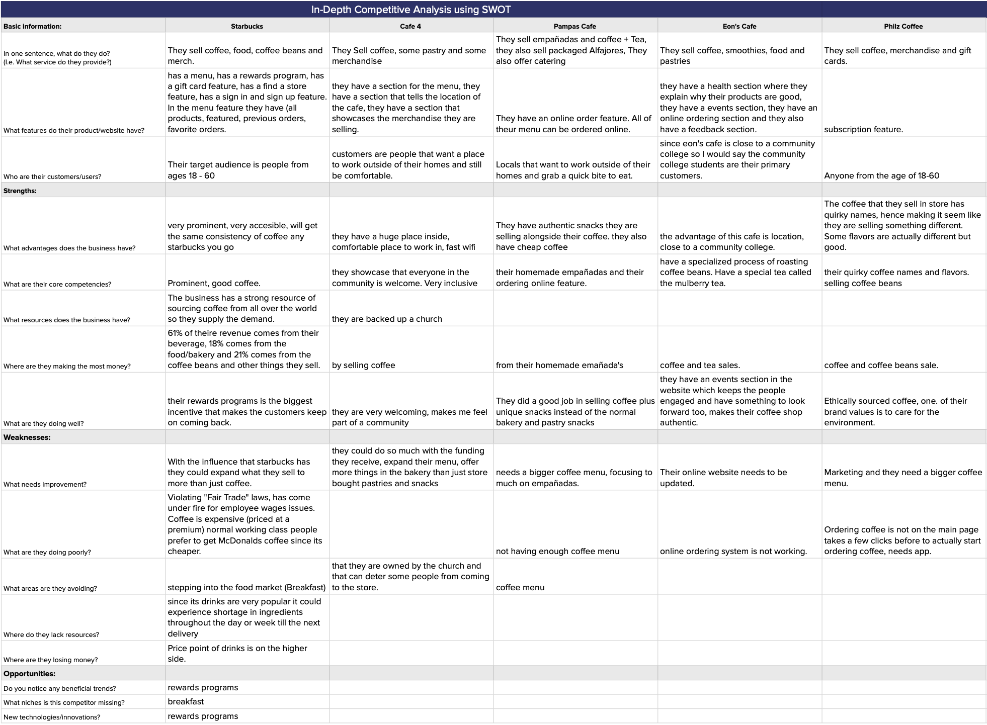
To ensure the solution stood out in a competitive market, I performed a competitive analysis, exploring similar businesses' digital strategies to identify opportunities and best practices. This research laid the foundation for a user-centered approach, ensuring the final design was both functional and reflective of Cafe Rumi’s unique charm.
Key Insights
Starbucks, Philz coffee and Cafe 4 have a very fluid and easy to use website, while Eon Cafe and Pampas cafe’s websites are very outdated hard to navigate.
Cafe 4 is one of the only local cafes that has a very good and updated website.
The big coffee companies such as Philz Coffee and Starbucks prominently market only their products, while Cafe 4 markets the experience of going in a local cafe alongside with selling their coffee.
Only the big coffee companies such as Philz Coffee and Starbucks has an online ordering system, the other 3 local cafes do not have an online ordering system.
Compared to Philz Coffee Starbucks has an easier UI for ordering drinks.
User Interviews
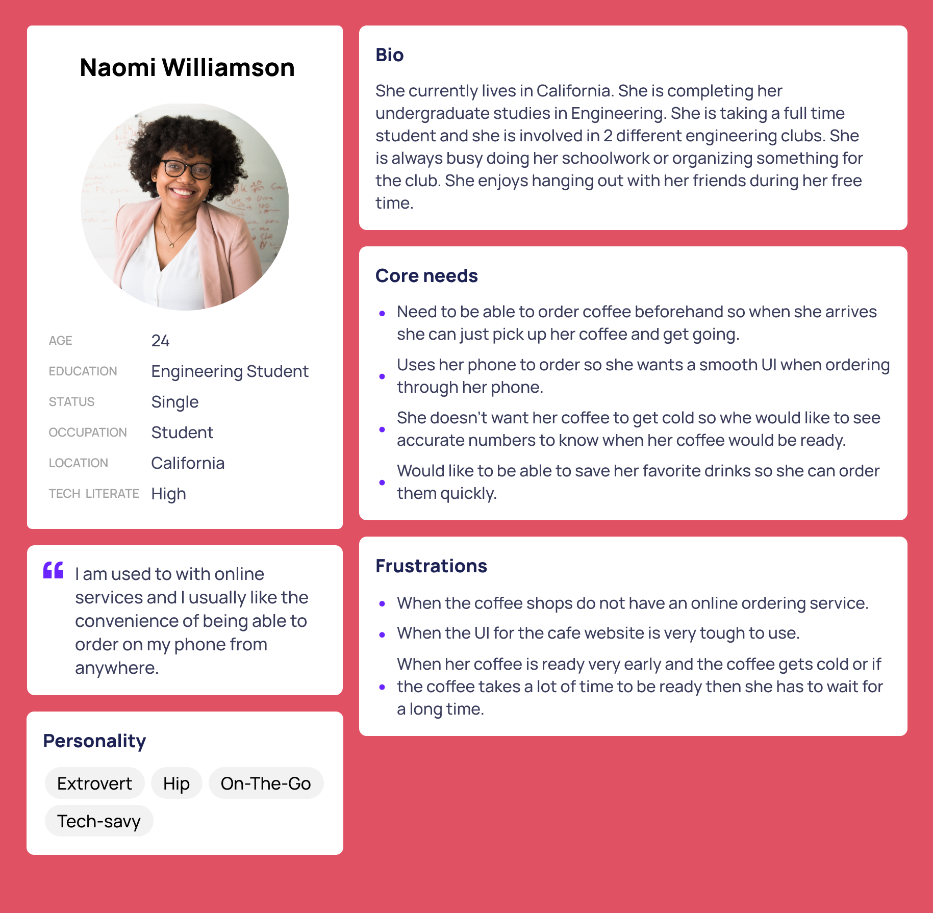
To create a digital experience that resonated with Cafe Rumi’s customers, I conducted user interviews to understand their needs, preferences, and pain points. Insights from these interviews informed the creation of detailed personas, representing key customer segments and their goals.
User Wants and Needs:
The cafe displays its menu, pricing information and hours.
A very easy to navigate and straight forward website
The photos of the inside of the cafe are displayed.
Displays dietary and basic information on the menu.
User Personas
Challenges and Pain Points:
Having trouble navigating the website
The website does not display any pictures inside of the cafe
Does not have an online ordering feature
have trouble using the UI of the website
Prioritization/Roadmapping
Sitemap
User Task Flows
User Journey Map
Sign in and Log in.
Online ordering.
Finding cafe location details and hours.
Contacting the cafe.
Design
Branding
For the logo I chose a minimalistic logo that captures the eye of the consumers while not being too loud. I also added a word mark on the bottom of the logo in the Pacifica font to add a modern touch on the minimalistic logo. For the Primary color palette I chose the color “Rich Coffee Brown” because this color resembles the rich hue of coffee and serves as the primary color. It conveys warmth and comfort, aligning with the cafe’s cozy atmosphere. I chose the “Creamy Beige” to compliment the “Rich Coffee Brown” because it adds a sense of elegance and cleanliness. It can be used for background, subtle accents. I added the color “Pink” to pay homage to the pink chai that the cafe sells as important call-to-action buttons or to draw attention.
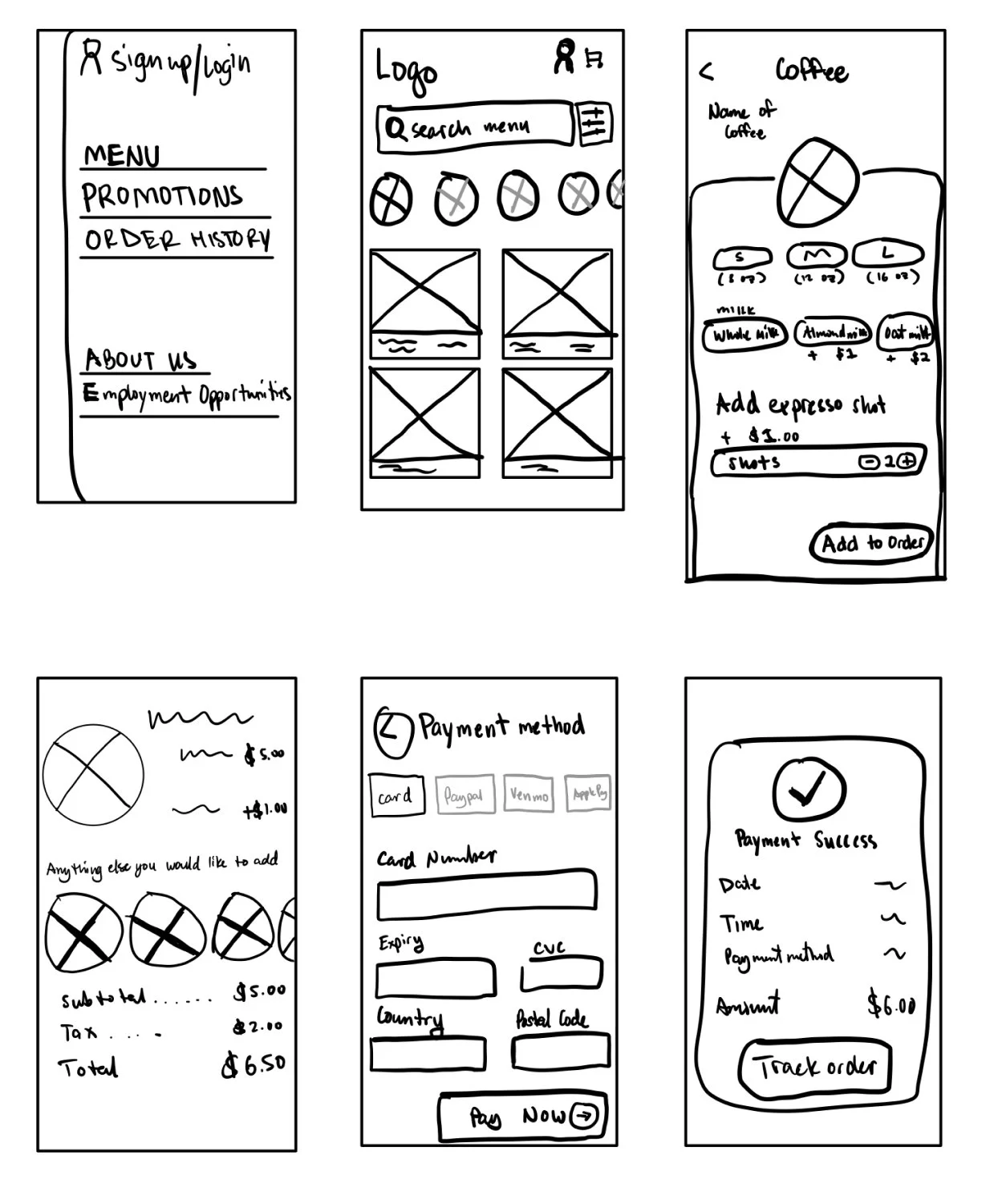
Low Fidelity Wireframes
Mid-Fi Wireframes
High Fidelity Wireframes
Usability Test
Determine how easily users can navigate the website, find menu items, customize orders, and complete the online ordering process.
Collect feedback on the visual design, layout, and overall aesthetics of the website to ensure it aligns with the cafe’s branding and provides an appealing user experience.
Analyze qualitative user feedback from usability testing sessions to uncover additional insights into their experience and suggestions for improvement.
Measure the time it takes for users to complete common tasks, such as selecting items, customizing orders, and proceeding through the checkout process.
Iterations
I added a selection tab for both the coffee/drinks section and food section.
I changed the back button to make it more visible. I changed the background of the title. Lastly I also changed the toggle tab for one of the customization menu’s.
After a user exits the ordering page, it takes them to the page where it shows the user the time it will take for the order to be ready. Once the user exits out of the page they are able to see the timer on the homepage.
Final Prototype
Project Takeaway/Future Considerations
One of the significant challenges I faced was the time constraint, that limited my ability to be able to explore the branding aspect. While working on the project I realized that branding isn’t something just about aesthetics, it’s about storytelling and invoking a sense of identity. In retrospect, dedicating more time to this crucial element would have further enriched the website’s character. This project was very straightforward so I had no trouble conducting the usability tests.
What made this project uniquely enjoyable was the tangible, day-to-day connection. I was able to work on a familiar local cafe that I frequently visit and made a website for it. Seeing the project come to life was very nice and motivating.
Final Prototype
Project Takeaway and future considerations
One of the significant challenges I faced was the time constraint, that limited my ability to be able to explore the branding aspect. While working on the project I realized that branding isn’t something just about aesthetics, it’s about storytelling and invoking a sense of identity. In retrospect, dedicating more time to this crucial element would have further enriched the website’s character. This project was very straightforward so I had no trouble conducting the usability tests.
What made this project uniquely enjoyable was the tangible, day-to-day connection. I was able to work on a familiar local cafe that I frequently visit and made a website for it. Seeing the project come to life was very nice and motivating.
